Android Impressions

Fitter, happier, more pastries.
Thanks to my latest aquatic shenanigans, I spent a week playing with a Nexus One. Here are my impressions. If I make any comparisons that lack context, assume they are drawn in relation to the iPhone.
Product quality
Hardware
Negative:
- Only 4.5GB of space by default (512MB flash + 4GB SD)
- Generally poorer battery performance than the iPhone
- Five buttons – KISS
Positive:
- Removable battery (I can't stress enough what a boon this is)
- Swappable micro SD card
- Screen is larger and higher resolution
- 5 megapixel camera with flash (compare to the iPhone's flashless 3 megapixel)
- 1GHz processor with 512MB RAM (600MHz/256MB for a 3GS)
The Nexus One has a substantial, polished feel. It's not exactly sexy in the ways the iPhone is, but it certainly doesn't feel like a cheap imitation. The specifications are pretty substantial, too. Given the superior hardware, it's understandable that battery life is inferior. Who knows about either phone's long-term battery performance. If the lithium-ion gods frown on you after a few months, you'll be forking over $79 with Apple and only $25 with Google.
Software
Negative:
- Inferior and slightly confusing UI
- Inferior app selection
- Browser feels clunky compared to Safari
Positive:
- Android OS is open source
- Android Market is growing
- Background apps
- Apps are cloud-oriented; no more syncing through slow, clunky iTunes

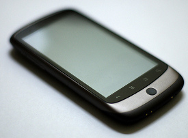
Look at those wee, beady buttons.
I found the UI to be the biggest barrier for me. I disliked the Nexus One's pentavirate of buttons before I had even turned it on. 'Back' and 'Search' are given permanent hardware real estate despite their limited applicability – many (if not most) apps have no use for them. 'Home' is present, but given a middle position with no tactile means of locating it – it's hard to switch apps in the dark.
And then there's the 'Menu' button – this is where the biggest problems lie. I'm an engineer, but I have a degree in Informatics – I have enough interface design and usability knowledge to cause trouble. Here's what I see in the 'Menu' button: the iPhone makes good use of affordances; Android does not. What do I mean?
An affordance is an aspect of an object that makes it obvious how the object is to be used. […] Affordances must be visible to aid interpretation.1
The 'Menu' button doesn't make its functions obvious. If you press it, a menu comes up; if you hold it down, the on-screen keyboard appears. Both functions could be loosely associated with the button's graphic, but one would never guess them by simply looking at the button. This is minor, though; one can figure this functionality out quickly, and once it's known, that's that. What is bad is the precedent that this button sets for applications.
The Android developer guide prefaces its section on Menu Design Guidelines with this assertion:
A menu holds a set of commands (user actions) that are normally hidden, and are accessible by a button, key, or gesture.
By convention, every Android interface has broken affordances. Apps are asked to obscure large portions of functionality in a hidden menu. Contrast this with Apple's in-depth iPhone Human Interface Guidelines:
Presenting choices to the user […] allows them to concentrate on accomplishing tasks with your application, instead of remembering how to operate it.
People tout simplicity as being the aspect of Apple's design that makes it superior. What they're trying to articulate is that the consistent application of good affordances allows users to approach every interface with knowledge about how to use it. The UI is not only simple – it's understood. Apple's defaults are a shared set of visible controls – (almost) everything that can be done is displayed using a common language. Android causes apps to fragment the user's knowledge — you have to individually discover and then remember exactly what can be done by every app because much of the functionality is invisible.
For consumers and developers

The Apple Analytical Engine
only accepts papyrus punch cards.
I've spent a bit of time talking about what I perceive to be the biggest weakness in the Android platform. This section is much friendlier towards Android.
Android is a platform for hackers. It's open source, and can be hacked using any JVM language on any development platform. The iPhone requires you to purchase an expensive Apple computer, use only the approved tools/languages , and pay $99/year to be part of the developer program. Android phones also come unlocked – that is, you can use them with any network.
I've heard it suggested that Apple's closed platform will lead to better quality and a tighter control on the market. These sound like great things for Apple. As consumers, we don't necessarily want Apple to have control, and we don't want to be hogtied to AT&T – we want competition to force continued innovation.
There are copious blog posts discussing the negative ramifications of Apple's closed platform. If you've read none of them, Tinkerer's Sunset and the post of Alex Payne's that inspired it (or at the very least inspired the title) are good start. I don't have much to add here. Limiting developers' tools or languages stifles innovation. The inverted version is what attracts me to Android: granting freedom to developers promotes innovation.
Conclusion
The Nexus One hardware and the openness of the Android platform outweigh any UI advantage held by the iPhone. As this assertion comes from a guy who spends upwards of 8 hours a day inside emacs or a Linux terminal, it should be taken with a few grains of salt. When my contract with AT&T is up, however, I'll be looking to the Android market for my next phone. And I'd love to get ahold of an Android tablet.
1 Mary Beth Rosson and John M. Carroll, Usability Engineering (Morgan Kaufmann, 2002), 124. ↵
